Monday, February 15, 2016

Beaches


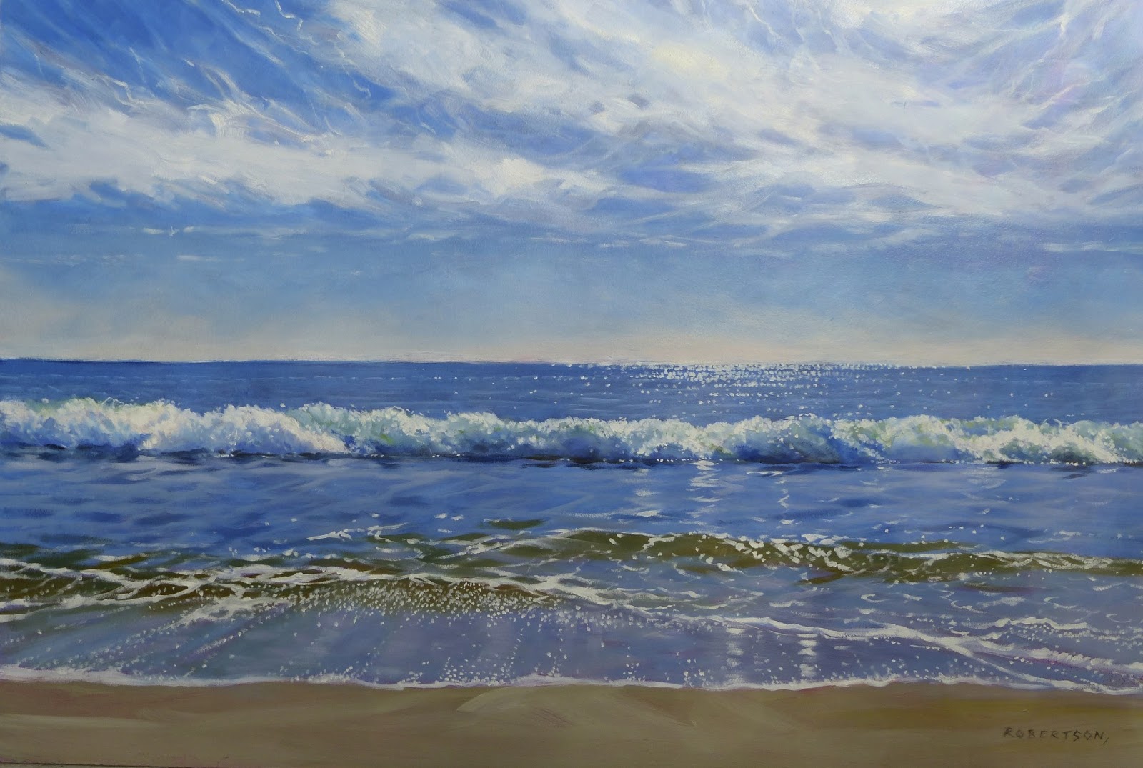
We started this year with a trip to San Jose, Mexico. Alan and I have 2 great galleries that we are represented by, down there- The Old Town Gallery in San Jose , and The Golden Cactus Gallery, in Cabo. I love the beaches in the area and since we got home, I've been working on a series of beach paintings. These are oil paintings, and each one is teaching me more about working with oils. Painting #3 is well along.

I've gone through a lot of cobalt blue so went off to Opus yesterday to get a big new tube- wow- cost about $100.00! Too bad I love that colour so much.

Spring classes are about to begin. I have weekly classes starting in Fort Langley in March, plus a weekend class in West Van in April. Just booked a summer class in Whistler in August. All details are on my website if you're interested.

Wednesday, December 23, 2015

Pine times 2


                                                Against the Sky  22 x 24" oil
Against the Sky- study 14 x 11" acrylic

Now and then I like to do a small study first, before I do a larger version of an image. I had fun doing both pieces and learned some things from the study that, I think, helped make the final version stronger. I wanted the rocks to be looser and for the shape of the tree to be less busy. I painted the final version in oil so I could really blend the transitions in the sky. I do like the drips in the study though.

Tuesday, December 1, 2015

Raven I & Raven II


Here's the newest two raven pieces. They are 9 x 12's and have been delivered to the Birthplace of BC Gallery in Fort Langley today.

Tuesday, October 27, 2015

Creatures

These are three of my recent animal series paintings. I'm still exploring the textured abstract backgrounds with realistic subjects. I'm having way too much fun and getting more confident as I do each new one. The white chicken was done right after the crows. After the uber- colourful background in the crows, I suddenly felt the need for extreme colour restraint, so I started the chicken piece with black.


Saturday, October 10, 2015

Bully Boys


"Bully Boys"   18 x 24" acrylic
This is another painting done on hardwood panel. I'm into experimenting with texture right now and marrying the realistic with the abstract. I started the background first, then roughed in the calves. Then I went back to working on the background with a lot of drips and scratching and dragging through the wet paint. Once everything was dry, I finished the calves and then went back into the background with more negative and positive shapes. I kept to a limited palette for this painting: ultramarine blue, quin red, quin gold, quin burnt orange, dioxazine purple and white.

Monday, September 14, 2015

My Favourite Model

"Duet" 36 x 48" acrylic
I'm not sure how many times I have painted this tree, but let's just say- a lot! The reference photo I used was taken on my last trip to Pender Island and strangely, I had never noticed the second smaller tree in any photos before. This painting is large and I managed to keep it quite loose. I tried to do just enough brushwork to tell the story. For me, the larger paintings are easier- I envy those that can do tiny delicious little paintings.

Tuesday, August 4, 2015

Still crowing

"Bad Boys"  16 x 26" acrylic
I started this painting as a demo at the Birthplace of BC Gallery this past weekend. Just did a bit more tweaking to it at home this morning and I think it's done. I used three different photos for the crows, so I started with a life size sketch on paper to figure out the composition.

The background was done intuitively and I didn't preplan it much, other than to paint quinacridone gold as the base colour and consider having light coming through the four corners. This is a fun and also nerve wracking way to paint for me. It can get overworked so easily- too busy, too muddy, too dark, too light. I did lots of glazes, wet-in-wet and edge softening with water. I allowed drips to happen and sometimes guided them with a small round brush.

The crows, I painted with as much realism as I can muster. I like the contrast between the realism of the subjects and the abstract quality of the background.